Presenting your research
Find out the best way to present your research in journals, conference presentations, poster papers and other media.

These resources and links will help you navigate the publishing process, as well as provide tips on effectively presenting conference papers and posters.
We know how important it is to get all the details right, so we have provided some information about how to enhance your presentations, so that all your hard work is seen in the best possible light.
For more detailed information, follow the links.
Measuring your research impact
Responding to feedback
Dealing with reviewer feedback can be daunting. To make the process less nerve wracking, here are some basic tips for responding to reviewers
Presenting at conferences
Need to impress a large audience? Here are some tips and advice.
- Giving a presentation - an introduction to preparing and rehearsing for a presentation.
- 3MT - how to make the most of your 3MT presentation.
Creating an academic poster
A poster provides an opportunity for making valuable contacts. At a conference, a member of the research team stands by the poster display ready to engage in meaningful dialogue with interested conference attendees.
A poster can convey your message to a large audience. However, if your poster does not grab people’s attention, your efforts have been in vain.
If you succeed in capturing someone’s attention, you have about 30 seconds to convey an overall understanding of the project. If they are interested, they will spend additional time exploring the information and asking questions.
Academic posters should
- ‘Sell’ your work immediately
- Look appealing
- Display research simply but effectively
- Contain the appropriate balance of text and visual data.
The poster examples featured below have all been produced by students and researchers at Lincoln University. Although all are quite different, each meets the criteria stated above. Follow the links to learn how to create an eye-catching and effective poster.
Review conference poster guidelines.
It is good practice to conceptualise how your poster will look before you begin. By spending a small amount of time to create a rough visualisation, without detailed content, you can gauge the overall appearance and impact of your poster. This allows you to consider the dimensions and proportions and how clear or legible your message will be.
Before deciding on a colour scheme, ask yourself if your topic suggests colours that could be used symbolically and help communicate your message. Colours like green (environment, nature) and red (danger) are such colours. Another option is to use a main image or graph as a starting point for a unifying colour scheme.
If you have presented an abstract for your work (ie for a conference), use that to begin condensing your work into concise, clearly communicated sections and associated points and visuals.

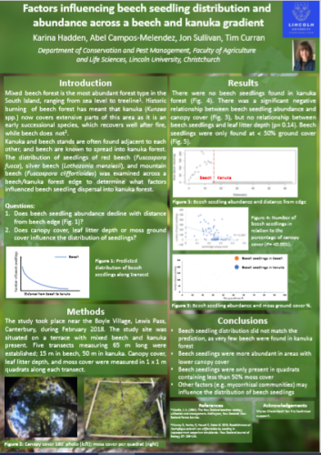
Hadden, K., Campos-Melendez, A., Sullivan, J., & Curran, T. (2018). Poster provided by authors.
- Consult any provided guidelines to confirm what size the poster should be. Correctly size the poster before adding content.
- Consider the two levels of organisation required – visual and narrative.
- Decide whether you will present information in columns or rows, left to right, or top to bottom.
- Consider how you will structure your content and what section headings you will have.
- Although your guidelines and purpose may dictate otherwise, one common option is IMRaD
- Introduction – the issue and significance of the study
- Methods – how the data was gathered and analysed
- Results – key findings
- and
- Discussion (or Conclusions)
Other important components of the poster are the title, names of all authors (including supervisors if appropriate), pictures, graphs and charts. It is also important to include the university and sponsor recognition and to use current Lincoln University branding. References, and accurate citation throughout, are also required.
Some posters can present the information in a Problem/Solution structure, while some guidelines will accommodate greater creativity for form and content. Keep in mind your purpose: clear communication of your research in a way that draws people in and maintains their interest while adhering to any non-negotiable requirements. Within these confines there is likely to be room for creativity.

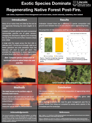
Sutton, L., (2019). Poster provided by author.
Think about whose attention you want to attract and for what reason. This will determine content, context and terminology. Even if you are presenting to experts, the information should be clear enough that someone new to the topic could understand it.
You must be selective. It is tempting to want to include ‘everything’ that seems important, but too much text can overwhelm a viewer and may discourage any engagement at all. (300 – 800 words is a guide) Choose information that you must have, or that is most interesting, rather than what is nice to have.
Think ‘big picture’ and build your poster around your main findings. You can always supply or direct an interested party to more information or elaborate on it yourself if you are nearby while they view.
Left aligned text is easiest to read.
Generally, use bullet points rather than full sentences.
Sans serif fonts are the easiest to read, eg Arial, Calibri, Helvetica. Do not use gimmicky fonts (eg comic sans) as they could undermine your work.
As a guide, the font size for an A0 sized poster should be:
- titles 72+
- sub-titles 54+
- text 30+
- sub-text 20+
Highlight important words and phrases. In fact, consider using just those words. Underline or make them bold.
Avoid using too many different formats, sizes and colours, and avoid 3D effects. These can be confusing and detract from the clarity of your research.

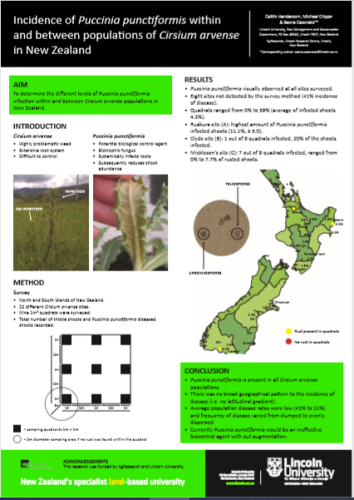
Henderson, C., Cripps, M., & Casonato, S. (2019). Poster provided by authors.
- Aim to represent as much as possible visually to help limit the amount of text needed.
- Remember what looks good on the screen may not look good at actual size in print.
- Images should have as high a resolution as possible: 80 – 120 pixels per cm is good for a poster.
- Do not overload tables with data or rely on graphs or tables to tell the whole story.
- Using colour and formatting in graphs and tables is a good way to distinguish data.
- Graphs and charts should include a descriptive title.
- Each axis must have a legible label. Avoid including gridlines and label the data instead of using legends.
- Make sure all figures and images are properly referenced.

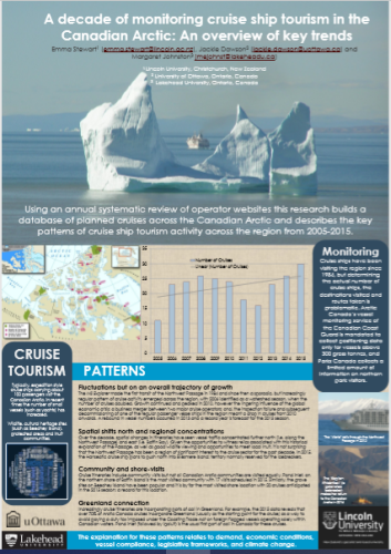
Stewart, Dawson, and Johnston (2015)

